Your Contact Page Is Important
Have you given your contact page enough attention? I know a lot of us just treat our contact pages as after-thoughts and don’t give much attention to them.
But, this can be a big mistake. Your website contact page is a great place to build trust with your potential clients because it lets visitors know you want to make it easy for people to communicate with you.
So, let’s dive in and learn what we can do to improve our contact pages.

What To Include On Your Contact Page
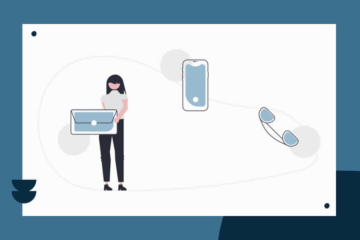
In order to build a better contact page, you first want to make sure you include the typical pieces of information everyone needs to be able to contact you. Here’s a great list to get you started:
- Phone number: A phone number is essential! I know I get frustrated on websites when I can’t find a phone number for the business. So, make your phone number easy to find. As a bonus, you can even include a link to automatically dial the number.
- Email Address: Like with your phone number, you also want to make your email address easy to find. Again, you can make things easier by including a link that automatically starts an email for your site visitor.
- Physical Address: If you have a physical place of business, you want people to find you. Make sure to include not only your street address, but also provide directions to your business location from common highways or populate routes. Additionally, having your physical address on your contact page will help boost your Local SEO.
- Map: Including a Google Map showing your place of business can also be a nice touch. However, note that embedding a map can slow down how fast the page loads.
- Operating Hours: Again, if you have a physical business location, please include your business hours! People want to know if you’re open before they head out. Even if you don’t have a physical location, including your business hours can help people know when to expect a response from you.
- Contact Form: Most people expect to see a contact form on your contact page. So, include one! While you can use your contact form to collect additional information about the site visitor or why they’re reaching out, make sure not to make the form too long. People don’t like to fill out long forms, and you don’t want to discourage them from reaching out.
Other Ways To Improve Your Contact Page
If you want to make your contact page stand out, you can think about adding some extra elements that make the page more useful for your site visitors or for you!
Here are a few suggestions to think about:
- Quote Forms: If you’d like visitors to be able to request a quote online, using your contact form can be a great way to do that. Just add a few more fields or questions to your contact form to gather some additional information about what the site visitor would like to do.
- Social Media Links: If social media is an important part of your content marketing strategy, make sure you include the links to all your social profiles on the contact page.
- Helpful Resources: Another nice touch is to include links to helpful resources, such as an FAQ page or a knowledge base. You could even answer some of the most popular questions right on the contact page.
- Welcome Video: Give your page a personal flair by including a welcome video for people to watch. A video is a great way to build trust and welcome someone to your business.
- Thank You Page: Impress people who complete your forms by sending them to a Thank You Page. This page lets them know their contact form was successfully submitted. Also, it gives you an opportunity to share some additional information about what comes next or about you or your business.
How To Design Your Contact Page
Keep Things Simple
Just like any other page on your website, you are designing the contact page for your website visitor. So, your first task is to make sure all of the necessary contact information is easy to read and easy to find.
Also, if you have multiple ways to contact you, make sure you include all of them on the page. For example, you might have a different phone number or email address for customer support. If so, make sure they’re listed on the page and are easy for people to find.
Try to keep the page clean and uncluttered. It’s probably not the page where you want to go wild with your creativity. Site visitors tend to go to the contact page to quickly figure out how to reach out to you or find out your hours of business. So, don’t frustrate visitors by creating a unique page that’s hard to navigate or understand. Make it easy, and don’t make people think!
Finally, when laying out all of the elements on the page, give everything enough breathing room, or white space, so the page doesn’t feel overwhelming.
Contact Forms
Again, contact forms aren’t the place to test out new design ideas. You want to make sure everyone understands how to complete the forms on your page. So, it’s very important to include labels for your form fields, and to clearly indicate if a field is required or not.
One of my pet peeves are form fields that are just too short! Have you ever tried to complete a form, and you can’t write your entire name because there’s not enough room? Help your site visitors out, and give them plenty of space in each field.
Make the submit button easy to find, too! And, it’s a good idea to let people know when something goes wrong with error messages that help them figure out what went wrong.
Contact Page Inspiration
There’s nothing wrong with looking for inspiration on the web. In fact, it’s a great way to figure out what works and what doesn’t.
I suggest you take some time and just go to some of your favorite websites. Then, spend some time on the contact pages. Take note of what you like, don’t like, and what you could improve.
For more inspiration, here’s a nice article from HubSpot that shares a bunch of creative contact pages. Now, just because HubSpot likes them, doesn’t mean you have to! Again, form your own opinions about what would work for you as a customer or visitor to that website.
Contact Pages I Like
I followed my own advice and reviewed all of the contact pages from the article above. Here are the pages I liked the best and why!
Marvel
I liked Marvel’s contact page, which you can find here. I liked this page because the contact form is front and center on the page. I didn’t have to hunt around to find it. Also, the page provides links to other useful information, so if you just want a quick answer, you won’t have to send an email. Finally, it’s just fun and fits with the overall design of the website.
Yummygum
I also like Yummygum’s page, which you find here. I really like the simplicity of the contact form. But, I would outline the entire form fields instead of just the underline. That would make the form more accessible.
Also, I like all of the breathing room in the design. That actually makes information easier to find.
Finally, I just love the map. I like how popular landmarks are on the map to help customers orient themselves to the location of the business. And, all of the important contact information is there and easy to find.
Is Your Contact Page Up To Snuff?
While contact pages appear to be relatively simple pages, you do need to put some thought into them when designing and building them. So, take a look at your contact page and make sure it’s providing a good user experience for your website visitors.